I’m reading a book on rattle. In rattle, data exploration is easy.
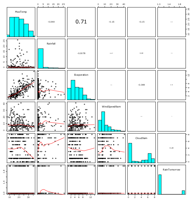
To see pairs (or splom) plot, select explore tab then click execute. Following is the output for weather dataset.

There’s histogram in the diagonal. Upper right side has correlation in numbers. Lower left has scatter plot with smoothing lines.
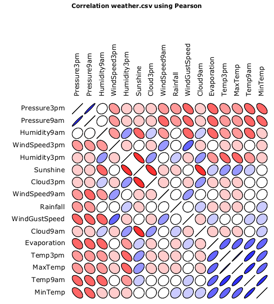
To see correlation, check correlation radio button in Explore tab and click execute:

Shape in the picture represents correlation; high correlation = line and low correlation = ellipsis or circle. Blue color represents plus correlation while red is for minus.
I like rattle as its output comes with corresponding R commands. In Log tab, every commands used for diagrams are shown.